
New Website!

After lots of putting it off, and struggling with themes, my new website is finally finished! It contains lots of University work that never got posted up on here, so I heartily encourage you to check it out! If you hover over the ‘Portfolio’ tab a series of sub-menus will appear that will take you to whatever artwork you wish to view, whether it be comics, children’s illustrations, or fan art – many of which I’ve yet to post on here – be sure when scrolling down through the pages you give the theme time to load up all the images ![]()
There are links to the facebook page and twitter page (to which I’ve relinquished control over to the site’s mascot; Cosmo Cat – be sure to follow him for arty updates from myself, and other artists I follow) as well as links to my deviantART, Instagram and of course, right here at Q.U.A.R.C.S! I’d like to thank all of you who have ‘followed’ me from when I started this blog back in 2009, your support and encouragement has been a great motivator so far, and any love for these new site’s would be gratefully received!
![]()
![]()
Project: Rooftop – Shadowman
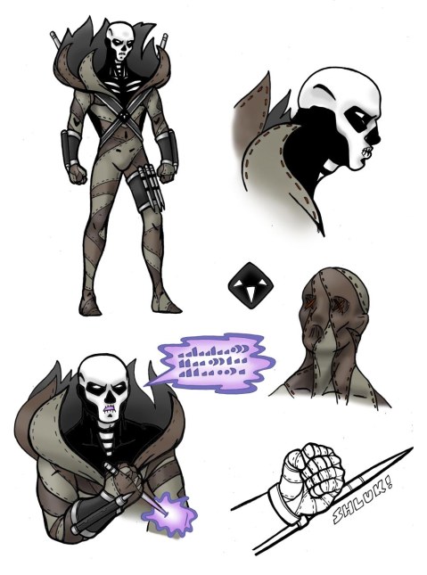
The most recent P:R redesign contest theme was Shadowman, a superhero from the Valiant Comics universe, with super human powers based on voodoo concepts and magic (you can learn more about the character from clicking the link on his name to take you to the corresponding Wiki page) – the series even spawned a successful game on the N64, where the character was re-imagined as a guy with sunglasses and a skull-like mask protruding from his bare chest (this is the version I remember) – the original was very 80’s, with long black hair and a rock musician background (think The Crow, only less goth…) but the new design is pretty cool, with an all black SWAT-gear type costume and skull face-paint.
I wanted to keep this voodoo priest/skull look for my design, and extended it to a full head and neck job (partially inspired by my brother’s recent halloween costume) but I went even further by changing his whole costume into a voodoo-doll type thing, complete with ‘pins’, which are actually spears, knives and gauntlets made to appear that way. My design suggests his powers have become more magic-based too, as he can paralyse his opponents by muttering a special incantation, and plunging a ‘pin’ into a limb of his choice, disabling his enemy, but not himself (except when he pushes one into his heart – this will kill his target, but leave him comatose and vulnerable for days afterwards – only to be used in one-on-one fights) – this particular magic will only work when he is in possession of something previously owned by his victim (like hair for example).
Another thing he can do is wrap himself completely in his costume for protection/regeneration (this would come in particularly handy if he’d just pulled the pin-to-the-heart move) – this was meant to encourage the spooky voodoo-doll look, but I can’t help but feel it reminds me of The Scarecrow for Batman Begins… damn. The diamond shaped belt buckle is a simplified version of his logo, removing the man shape, but keeping the ‘3 horns of Bosou’ – perhaps suggesting a departure from humanity maybe…? (deep)
So this was fun, and ever since i’ve been working my ass off… I’ve got a day off tomorrow, but I have numerous commissions to do before I can draw anything I actually WANT to draw, and as it’s almost International Gift Exchange Day (or Christmas as you Christians like to call it) I’d better get on with them, as I need the money – no rest for the wicked as they say -sigh-
Knights Of The Round: The Dark Knight
It’s round two of the Knights Of The Round Tumblr competition, and this round’s theme is ‘Dark Knights’ in honour of the release of The Dark Knight Rises (which is excellent by the way, go see it if you haven’t already). Your illustration didn’t HAVE to include Batman; it could have featured a dark knight of any kind, but how many chances do you get to draw ole Batsy eh?

Be sure to check out the other great entries on the Tumblr, maybe even give Round 3 a go when it comes by 🙂
Fantastic Four: Fashion Forward – Rough and Ready
As promised, here’s a post including larger versions of my finished Fantastic Four costume redesigns, complete with the roughs that lead me there. Project Rooftop tweeted recently that the winner of the FF: FF competition will be announced soon, so good luck to all those that got their entries in on time 🙂
As always, click on the image to enlarge, this may help when trying to read my hastily scrawled notes, or if you want to look at one of the alternative FF logos or even just fancy a better look at Reed’s equipment… *cough* (warning: I forgot to resize one of the Invisible Woman roughs, as well as one of the Human Torch’s, so they’ll be quite large).
For my thoughts on the finished designs, or explanations to any thing you see here, please visit the original post, which you can find here: Q.U.A.R.C.S – everything should be covered, I went on quite a bit…
Mister Fantastic


")
Invisible Woman


")
The Thing


")
Human Torch


")
The FF Logo

")
Project: Rooftop – “Fantastic Four: Fashion Forward”
The most recent competition by online nerd-mecca Project: Rooftop was to redesign the costumes of the Fantastic Four. I was really excited by this project, as redesigning Invincible for their previous competition was a lot of fun, and after somehow making the ‘honourable mentions’ list, I thought I would see if I could better myself. After putting it off for the standard amount of time, I set to work sketching and researching the individual characters to see what they might WANT to wear. Dogged by some difficulty with proportions (I really need to get back into the swing of superhero form and posture) I was started to get somewhere on holiday, and by the time we got back I had a hundred ideas, and four really solid ones. Unfortunately by that time there was a LOT of over-time going at work, and I am literally too broke to turn it down. As the deadline approached and my free time disappeared, it seemed pretty clear that I wasn’t going to make it. Even with the deadline extended by a week, the project seemed doomed, and with my knackered old PC finally giving in, and an unfamiliar version of photoshop to deal with on my laptop (therefore having to deal with a time-consuming learning process), it was the final nail in the coffin for the competition. Still, by that point I had put too much work in, so I’ve been finishing it off on my days off ever since.
So here’s my entry in it’s ‘under 1000 pixels’ format
-2") You can click to make it bigger, but it’ll only zoom so far, so I may include pics of the individual costumes at a later point so you can see further detail
You can click to make it bigger, but it’ll only zoom so far, so I may include pics of the individual costumes at a later point so you can see further detail
Concept Notes
For me, change needs a reason – for Invincible’s redesign I gave him a helmet to a) disguise his face or b) as a breathing apparatus incase he needed to be in space for longer than a week/there was a threat of a virus – in the FF’s case, that reason is the recession…
Reed Richards, Mister Fantastic
Reed is an Inventor, and seems to come up with some new gizmo every week. Unlike Tony Stark however, he doesn’t sell his tech to the highest bidder – instead their funds seem to come from their celebrity status or some mysterious trust fund (weren’t the Storms rich?). However the recession has hit everyone hard, so Sue Storm (the Invisible Woman) suggests selling some of his inventions to earn some extra capital.
Reed reluctantly agrees to share his Fantasticar technology with the US Airforce, under the proviso that Ben Grimm (The Thing) keep an eye on things. He also agrees to hand over the patent on his ‘Unstable Molecules’ clothing technology to Johnny Storm (The Human Torch) so that he can start his own clothing brand of highly fashionable, yet easily adaptable and durable clothing. The thinking here was that it would finally give Johnny something to do where his strengths lie, it would earn money for the group/brand, and it was in his contract that he MUST supply this durable/adaptable to the homeless, or mutants that need it once every month.
Sue Storm takes control of the business side of things, and therefore has less time to spend with Reed. With Sue not around so much to keep him grounded, Reed becomes increasingly lost in his own work, forgetting to shower regularly or shave, giving him a slightly wild, unkempt look.
With Reed’s costume I wanted to highlight the fact that as he can stretch, there’s literally no part of his body he can’t reach, and therefore I overloaded him with straps and a high-tech back-pack – this doesn’t need to look the same for each comic, and in fact would be better if Reed ‘packed it’ with technology he thought would be relevant to the mission/some new gizmo he wanted to try. The uniform Johnny designed for him is meant to resemble a college professors shirt and waistcoat combo (to go with his fuddy-duddy attitude), complete with white scientist jacket to complete the look. As a traditionalist, and a pragmatist it was Reed himself that insisted he keep the old-school gloves and boots – they were more practical.
Sue Storm/Richards, The Invisible Woman
Because Sue is now head off the FF brand, she becomes much more focused and business orientated. Her costume resembles a lady’s trouser suit, and her hair is always in an up do these days – it just looks more professional. I wanted to give her a long coat, as I thought a) it goes with her new ‘business woman’ look and b) it would look really cool with her invisibility powers – it would appear as if she were floating around like a ghost.
With all Sue’s attention on the business, and all Reed’s attention on on other dimensions and the horrors they might contain, their marriage is suffering, but neither seems to be noticing…
Note: In case it’s not clear in this smaller version of the original picture, Sue is using her ability to project force-fields in whatever shape and size she wishes to type with multiple ‘force-fingers’ on her Fpad (TM)
Ben Grimm, The Thing
Ben spends a lot of his time at the recently reopened and refurbished Mitchel Air force Base, New York, where together with some of his old air force buddies and contacts from Nasa they work to design new fighter jets based on Reed’s Fantasticar designs, and train the young pilots chosen to fly them. Requesting that Johnny design him something a little more suitable, Johnny creates a large, replica of an Air Force Jacket, complete with various patches to showcase his military background – even an FF belt buckle styled after the USAF Logo. Ben Loves the Jacket so much, he’ll take it off before charging into battle, usually shrugging it off to his famous catchphrase “IT’S CLOBBERIN’ TIME!”. A practical joke Johnny likes to play is to stick a note to the inside of the jacket, so whenever he does take it off, it’s there for all to see, stuck on his back where he can’t reach – this could be a running gag in the comic (a different insult every time).
Being away from the Baxter Building so much is also causing Ben to become distant from the others… cracks may be appearing in Marvel’s first family…
Note: You might be able to see a tattoo on his right shoulder – it says ‘Petunia’ in reference to his ‘sweet Aunt’ – It’s chiselled and painted on, so every now and then it needs to be re-done
Johnny Storm, The Human Torch
Being the young, fame-hungry impetuous hot-head of the team suited Johnny well for a while, but he needed a project to focus on, a goal to achieve. Always being something of a clothes horse, Sue’s idea of him starting his own clothing brand (known as ‘Perfect Storm’) seemed ideal. Perfect Storm is a huge hit, with Johnny having a natural flair for fashion design, and now supplying clothes to celebrities, and custom uniforms for superhero’s worldwide. He’s even branched into his own fragrance ‘Flame On’ (for him and for her), with the only negative draw-back being that his already super-heated ego has now gone supernova…
Capitalising on the FF brand, Johnny converted the bottom floors of the Baxter Building into a Perfect Storm Store, and refusing to ‘live above a shop’ lives in a huge apartment over-looking Central Park.
Johnny has designed all the new FF uniforms, but as fashion is forever changing, and he’s something of a style icon, it’s rare for him to wear the exact same uniform twice – this gives the artist liberty to change the uniform depending on the fashion at the time, or some bizarre trend a celebrity in the real world happens to be sporting this week (as a parody) – Imagine Johnny Storm wearing a Lady Gaga style meat costume…
The Logo
I went through several Logo designs, and this one seemed to fit best. The logo comprises of four blocks that are arranged into an ‘F’ – the shapes of the blocks also correspond to the powers and sizes of the four superhero’s – 2 are the same size, one is the same width but stretched out, and the last is a large, solid block, and I’ve coloured one of the logo’s in the style of the individual to highlight this. I also think that on Reed and Sue’s costume designs it resembles a VIP or Visitors badge, and on Johnny’s it could be a price tag. The variants below are just to show what can be done with it, but personally I prefer it as it is.
**********************************************************************************
And if you read all that, congratulations! You deserve a cuppa! I do really appreciate it though, I’m gutted this never made the competition and only a handful of people will ever see it – but them’s the breaks as our American cousins might say. At least this way I can afford food, right? ![]()
As I said earlier, I’ll probably update, or provide a companion blog post to this one with the individual pictures in, and some of my rough sketches
In the meantime, Make Mine Marvel! *cough*…CHEESY…*cough*
Little White Lies – Super 8
Here’s my entry for the D&AD Illustration brief – a front cover design for Little White Lies magazine. the brief was to create an illustration in the same style of most that adorn the front cover of the magazine, that of a portrait depicting the main character, with hand-written type stating the name of the film itself – there were several films to choose from; I picked the JJ Abrams film ‘Super 8’.

Why Super 8?
I’ve watched Super 8 recently and I thought it was a excellent film – it features a simple if slightly over-used concept, and the genre of sci-fi/horror is not exactly new, but that fits in perfectly with it’s 70’s setting and small american town folksiness. Brilliantly acted by it’s young cast and given the extra sheen (and lens flares) that has made JJ Abrams a popular name, the film reminds me of E.T, and other alien-orientated adventures of my childhood days, such as Flight Of The Navigator and it’s this sense of nostalgia I get when I watch it that makes the film so endearing.
About the Design
I feel portraiture is a strength of mine, but finding a theme-appropriate setting for this portrait was at first, somewhat problematic – I drew several different versions of this same head (that of main star Joel Courtney) each with a different style, and while they were all good in different ways, I could not find a way to link them to the film (other than the fact that it features the main character of course) – most of the screen shots I found on Google just had him looking terrified, so I wanted to try a different approach. Eventually I had the idea of building his face from the tiny alien cubes that make up the alien’s spaceship in the movie – and I think it works really well. I was worried at one point that he was starting to resemble ‘Pinhead’ from the Hellraiser film franchise, but I think by softening the lines I’ve avoided that. He looks quite sad, but then the character goes through quite a lot of emotional turmoil during the length of the film, so I think a slightly forlorn expression is more than reasonable given the circumstances! Putting the text in a Super 8 film strip seemed like a no-brainer to me, and perhaps it IS a little obvious, but I’m hoping no-one else will have thought filling the entire background with the same strips – if only because drawing them took the longest out of everything!
Verdict
I’m really pleased with the finished design. What the white/grey head loses in depth that some of my other versions had, it gains in a sense of innocence, and spooky, other-worldly light. As already mentioned, I’m chuffed with the background – the time it took to draw paid off, and although I tried several colours, this dark purple/red/brown shade really makes a good contrast to the soft light of the head. The type lacks a little of my usual flare, but makes up for it in impact, and even looks kind of old-school too. Overall it was worth the time, hard-work and money I put into it, and even if I don’t win, I would be pleased to feature it in my portfolio.
Final piece – Line Work
Here’s the head and the film strips as I drew them, before they went through the Photoshop car wash:
")

Development Work
As mentioned above, I went through several versions of the head while i was trying to decide which one I would use. Here are the best of the rest:

– Pencils: This is of course, the medium I’m most confortable in, and while it was technically quite accurate, it was the safe option, and therefore rather boring…
– Brushpen: This one was a lot of fun actually. I never usually given myself the freedom of JUST using a brushpen, as usually the inaccuracy bugs me… but I really liked this one.
– Cross-Hatching: This was more my usual sort of style – tight, controlled line – some parts (such as the hair) work better than others (such as the skin tones) but I liked this one too – it seemed quite striking as an image
– Lines: Back to pencil again, this time with the aid of a ruler. I’d never done anything like this before, but I REALLY liked the effect – this was my second choice if the cubes hadn’t of worked.
Cross-Hatching Stages
Just as a parting gift, I though i would share the different stages of my cross-hatching piece. I scanned them in as I was going in case A) I needed a more basic version of the linework for something and B) quite frankly, in case I ballsed it up completely.
 copy")
Special thanks to Brogan, Martin and Andy for putting up with my MANY questions about the submission of artwork process, and Lucy for helping me make most of the important decisions!
Invincible: ‘Viltrumite Vogue’
I’ve been knocking out and putting up a lot of shop-based work in the last couple of days in an attempt to finance Christmas, and I couldn’t have done it with out my beautiful (and very well organised) girlfriend MIZZ Lucy Benson 🙂 (blog post with details to come…)
But as it’s a bit of a slog to get it up and running, I decided to reward myself by entering a competition I’d had my eye on, the afore mentioned “Invincible: Viltrumite Vogue” by Project Rooftop – a chance to redesign the costume of young hero Invincible (Image Comics) with the entries to be judged by the artists of the comics themselves!
My Design

The idea behind my design concept was basically… I thought it looked cool (hey, at least I’m honest!) but the finished design ended up looking quite armoured, and therefore rather redundant on a character who is as he is named… Invincible. So then I started thinking about WHY he would need such a costume:
1) Invincible loses his powers! – The new costume could be a ‘power-suit’ of sorts, designed to mimic his old abilities until he gets them back (if he ever gets them back!)
2) Invincible’s secret identity is at risk! – this costume covers him up entirely, meaning that if his identity were to come under suspicion, he could dress a superhero buddy in the new costume, and appear in his civvies right next to him with no-one knowing the difference!
3) Invincible needs to be in space longer than a week! – According to Wiki, Omni-man was able to hold his breath for an entire week once, on an extended trip to space – it wasn’t clear exactly how long Invincible could hold his, but even if it was the same, what if it took him longer to get there? What if he got lost? This costume could be a modified space-suit, with a small oxygen canister for the long trip (and a built in MP3 player to help relieve the boredom of flying for a WHOLE WEEK – yeesh!)
4) Invincible needs to avoid that virus like the plague! – The original Scourge virus wiped out almost the entire Viltrumite race, so what if Invincible had to fight a creature made of out of it? Or Zombie Viltrumites infected with it? Well he’d need a costume to protect him wouldn’t he! Or would he? (does being a hybrid protect him?)
Thoughts…
I do like my finished design – the body proportions are way off in places, but the general design concept is fairly clear, with the extra heads showing that the character can still be expressive and ‘human’ (a feature I think is important to include in a hero character) despite having his head enclosed in a full helmet. This mini-project was pretty frustrating in many ways: it seems that i had almost completely forgotten how to draw superheroes, and at one point I thought my computer was going to crash before I could save it, but it was a fun alternative to the large, and in terms of the comic I’m working on, rather over-bearing projects I’ve got going at the moment – I just hope that, although I SENT it before the EST Midnight deadline, they RECEIVED it before too ![]()
*EDIT*
And receive it they did! I got an ‘honourable mention’ and some very kind words from fellow Projects Rooftoppers! I really didn’t expect this, so big thanks to P:R and all the comments, I look forward to entering the next one!
