LoW – Pushing Daisies
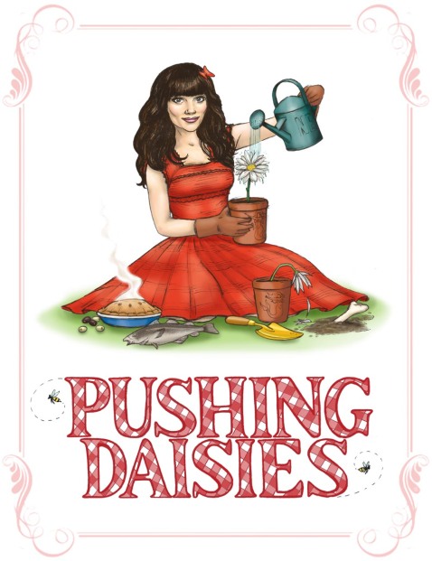
This weeks Lines Of Work theme, chosen by me, was ‘Cancelled TV Shows’ and was pretty much just an excuse for me to finally draw Charlotte ‘Chuck’ Charles from the cancelled American TV Show; Pushing Daisies.
Pushing Daisies was a quirky little show that was sort of a cross between a whodunnit, a romantic comedy, and some sort of zombie sitcom – it was cute, hilarious, and slightly creepy all at the same time. Chuck, played by british actress Anna Friel, was brought back to life by the magical touch of (arguably) the star of the show, Ned the Pie-maker (he made pies) but because anything brought back from the dead by Ned’s touch would instantly return to being dead at a second touch, the two could never be together, leading to some very strained will-they-won’t-they-but-how-could-they moments, but it was all part of the fun.
Despite being adorable, I can’t say hand on heart that Chuck is the most entertaining of the characters featured on the show (that honour has to go to either Olive, or my personal fave, Emerson Cod: Private Detective) but drawing her enabled me to try out more of a pin-up style illustration, and besides, she’s very central to the plot, so by featuring all sorts of references to other characters around her on the floor (some are more subtle than others) it all sort of made sense.
I spent far too long on this one really, but it was fun to do – I tried a more sketchy style to my inking, and it seemed to work ok – and although i have some difficulty with celebrity likenesses, I think she came through ok. The text isn’t perfect, but I’m pleased with that too.
I can’t recommend the show itself enough, it was a lot of fun, and nice to see something so clear of all the grit and grime that seems to be so popular these days. The outstanding plot was (mostly) wrapped up in the last episode, but it was rushed, and it’s a shame it never got the third season it deserved.
Spike
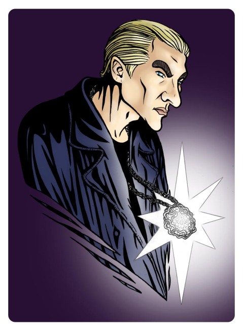
Last fortnight’s Lines Of Work theme was Buffy, so I drew William The Bloody, AKA Spike… and after posting it on the tumblr and my deviant page, I then completely forgot to blog it!
I tried a few things out with this one, most noticeably a more exaggerated, stretchy style – it both worked and didn’t work – annoyingly, the sketch looked much more like the subject BEFORE I added the ink (as is often the case) and in the end a lot of the work was done by the colour, which i feel was cheating a bit. On the other hand, I like the lighting in this one; the shadows and minimal colour tone work pretty well here, and i enjoy both the simplified star-like glow, and the shredded-bust effect – I’ll be using them again.
Out of curiosity I thought I’d see what the illustration would look like if I were to use Photoshop to warp it into more realistic proportions… now if you flick from looking at the head of one to the other, the original looks like the one that’s been stretched! Bizarre! Incidentally, this is a Q.U.A.R.C.S blog EXCLUSIVE (ooo!) so enjoy haha! 😛 – Chris
Help, I’m a Rock
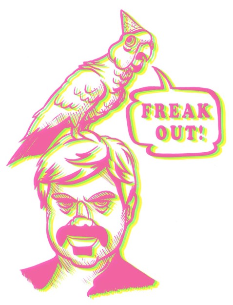
This week’s Lines Of Work theme is in support of Movember, in which we have to draw a portrait of ourselves sporting mustachios – I decided to go with Frank Zappa.
I also spent the whole time drawing it listening to “Freak Out” by Frank’s band The Mother Of Invention, and now I think I’m insane.
I’ve included the black and white version too as I couldn’t work out which one I liked best, and the photo of Zappa the picture is based on – groovy
Oh and by the way, the website I found the photo on said the bird’s name was Bird Reynolds, how amazingly amazing is THAT
…Susie Creamcheese, this is your conscience calling….
The INCREDIBLE Affair! (slightly NSFW)
I thought it would be fun to inject a bit of soap drama into the world of The Incredibles – in this case; lonely housewife with huge booty hooks up with the smooth talking, wealthy best friend of her husband… and he’s black! Scandalous.
This enabled me to express my slight crush on Mrs Incredible in an enjoyably crude way, and squeeze in a meme too – fun stuff. For those interested, the picture of Helen Parr was largely copied from a photo of Coco Austin, who’samazing ridiculous figure is the nearest I think it’s possible to get to the body shape of Elastigirl without actually having some kind of disfigurement.
See the other great Incredibles entries for last week’s Lines Of Work here!
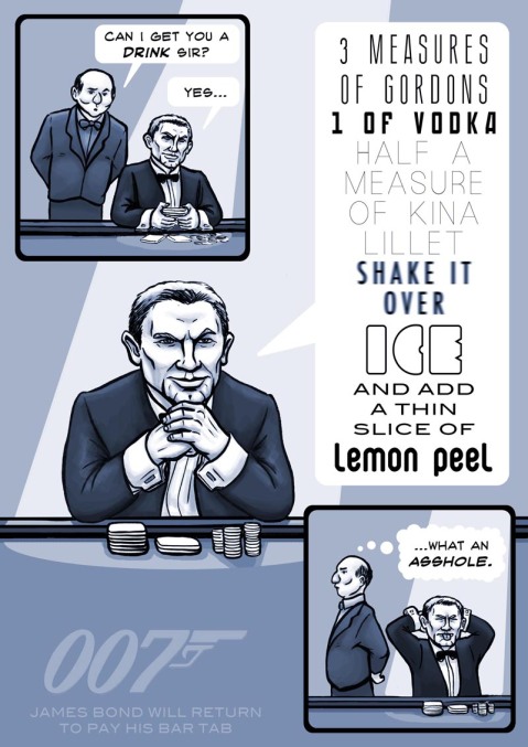
“The Vesper”
This one was for the Lines Of Work tumblr, that weeks theme being James Bond to celebrate it’s upcoming release (By the way, if you haven’t seen Skyfall yet you really should, it’s awesome) – follow the link to check out the other entries!
Tried a few things with lettering this time, including a failed attempt to squeeze the lettering into a Martini-shaped speech bubble – it didn’t work, but it’s all a learning experience right?
The idea behind this piece is inspired by my own reaction to this particular scene in 2006’s James Bond prequel Casino Royale, in which Bond manages to both intimidate his poker-playing nemesis by ordering a rather grand drink, and impress the glamorous girl by naming it after her. True, it’s a great scene, but as someone who’s worked behind a bar, all I could think was… what a pretentious prick!
Just to make it clear, I think Casino Royale is a brilliant film, and Daniel Craig actually makes a great Bond, just next time, keep the cocktail simple ok? Or order a beer for gods sake 😛
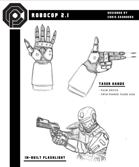
Robocop 2.1
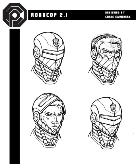
This weeks Lines Of Work theme was to redesign Robocop, inspired by the so-far unimpressive looking redesign photographed by paps at the shooting of the new Robocop reboot movie. This proved harder than I imagined at first, as it was difficult to modernise Robo without straying too far from his original, iconic design. My thoughts on the reboot design that there was not enough silver (in fact there was none) and while I reduced quite a lot of it in my own, it’s still there, and it really helps identify who he is I think.
There’s a lot in this design I DIDN’T include, as it was just taking far too long, and I have other things to work on – it’s strange though, once my brain got going on it I couldn’t seem to stop! Some parts were harder to get right than others – the shoulder pads for example, still don’t sit quite right to my eye. The wheels were hard too, but I’m pleased with how they came out – lots of mechanical men (and women) in the sci-fi world have little wheels that pop out of their feet (Iron-Man had them at one point) but rather than give him roller blades I wanted his legs to transform into ACTUAL wheels – I think they work quite well – they certainly make him look more nimble.
Anyway, as I said, I could go into way more depth on the design, so I’ll feature a little ‘Interview with the designer’ – which is of course, me – to fill in any gaps…
Thoughts from the designer, Dr Chris Saunders
The challenge with the new Robocop model was to create that balance between performance and personality, function and friendliness – the approachability of an automaton. The reason the original Robocop design was more popular as an law enforcement device, as opposed to the ED-209 for example, was not only that it was better designed (in my opinion) but also because of it’s human element – people could relate to it on a very basic level, it’s one patch of human skin showing on it’s jaw bridging that gap between cold hard steel and comforting human flesh. People trusted it, people got behind it – after some time it was even accepted into the Detroit Police force as an equal (although of course, it was far superior) and it was this likability factor I was encouraged to develop (after all, who wants to buy a product nobody likes?).
My first move was to create a more accessible face for the Robocop 2.1 design – his helmet now swings up to reveal a handsome face with minimal cybernetic enhancements to the actual face itself, and even a crop of hair on the front, top-half of his head (polls revealed that most people found the originals bald, stretched skin creepy) – this makes Robocop instantly more approachable and less menacing should say, someone simply want to ask for directions, or a sweet of granny wanting to report the theft of her handbag, or even a comforting look/reassuring smile for the crying rape victim (of course, if they were wearing my OCP funded, patent pending Chastity Belt 3000 it wouldn’t be an issue). he problem with having flesh on show however is that it’s vulnerable to explosives. fire and stray bullets, so the design features a series of retractible face plates for protection. The head also features a blue stripe and gold DPD shield as a nod to it’s fellow human police officers – it’s the little touches.
Another thing we did to keep this element of human interaction/acceptance was to include more of the original host’s personality in the Robocop 2.1’s system memory – this is made up of carefully selected memories, and desires/motivations revealed through the subjects initial psychiatric evalution, all vetted and approved my OCP – so that he is now able to laugh, so disgust, make jokes. In fact, more of his original digestive system was left in tact, so that he is now able to eat actual solids (again, polls indicated that the public feel police officers should be seen to eat doughnuts/hot-dogs – it’s just an image thing) and even ‘share a brew with the boys’ after a hard days patrol. Of course, alcohol and other solids are not processed in the same way as in human, and aside from a few essential vitamins and nutrients are broken in liquid waste, and passed through a new disposal unit located at the groin, developed by my associate Dr Win Ang. It was discovered that doing basic human things such as eating, drinking and going to the toilet not only help it to be accepted by it’s human co-workers, it also helps the mentality of the host itself – the process to cybernetic enhancement can be quite stressful on the brain, it’s amazing how much comfort it can take in the simple pleasures.
The Robocop 2.1 is modular in design, and many parts of it can be easily switched out and replaced if they are damaged, or if a larger, heavier weapon is needed – for example, at the moment we have a replacement left-arm unit that features a collapsable tri-pod and locking unit that houses a massive 50 caliber machine gun, with an ammunition pack that fits on the back of the Robocop 2.1 unit itself (not available in the standard pack). My proudest feature of the design are the wheels that can be activated for Pursuit Mode, but again they can be switched out into something that maybe more suitable (we are currently working on an aquatic prototype for the military know at the moment as ‘Roboseal’, but a similar device will probably be made available for the Robocop series). It also features OCP’s multi-purpose grenades, which can work as the standard grenade by holding the red button down on the top, and activating a 5 second timer that with explode when it is thrown/released. By clicking this button multiple time before it is held down, you can extend the timer by 5 second with each click. The explosive core at the bottom of the design can be removed, leaving a stun grenade that can be adapted into a smoke grenade by pulling back the timer section and allowing the phosphorus gas to escape before detonation. The explosive core meanwhile has a magnetic strip on the back, allowing it to be attached to another grenade for double the power, or for the entire grenade to become a mine, that can only be detonated by the Robocop 2.1 unit at a time of his choosing, at a distance up to 5 miles away!
The new Robocop is a human-friendly device able to patrol tirelessly, and cover almost any emergency a precinct might encounter. It’s amour and weapons make ideal for riot control, but it’s added ultraviolet enhancements enable it to investigate forensic police work too. It is tough, and our team are ready to repair any damages that might occur, and at the end of the day, unlike human police officers, it is expendable – why send a guy with a wife and two kids in to diffuse a bomb, when you can send the Robocop 2.1?
Thank you
Dr Chris Saunders, PHD
Chief Scientist at OCP Robotics and Cybernetics division, OCP Headquarters, Detroit
And now a word from our sponser….
The Robocop 2.1 unit is available for pre-order now from OCP.com at only $1,499,999! That’s cheaper than a Race car! With it you get the Robocop unit, recharging station and a team of experts into your station to maintain the unit/repair any damages. If you order now, you can get 20% off our Flightpack extra (usually a further $500,000).
Alternatively, if you’re after something larger, with more powerful weapons as standard, why not check out the new QUADROPED-209 at the OCP online store now!
OCP – Building a better Future for Everyone*
*this does not include the destitute, the mentally unstable or the uncultured.
Lobster Johnson
Here’s my entry for this week’s theme – Hellboy characters that aren’t Hellboy! Linky McLink
Lobster Johnson – not really sure who he is, but Wiki tells me he’s part of the Hellboy comic roster, and as far as I’m concerned he has one of the coolest superhero names going.
I’ve drawn him a little ‘squatter’ than I usually go with superheroes, and I can’t make up my mind whether I like it or not… I went for simple blocky colour job though, I quite like that 🙂
I’ve been either working, drunk or hungover for the last couple of days… I can’t seem to stop eating… urkk.
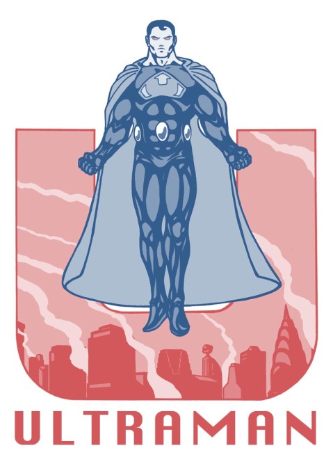
ULTRAMAN
Here be a picture of Ultraman that I drew for our (and by ‘our’ I mean some of my fellow Glyndwr Universtity post-grad chums) new Tumblr ‘Lines Of Work’ which you can find by following the link. In pretty much the exact same way as the WeDrawStuff blog, this is a little project to keep us fresh, keep us drawing, and keep us in contact with each other, and is updated fortnightly with a new theme – this week’s being ‘Superman Villains’
Notes:
I’m really pleased with this piece – having never drawn Supes before I found that I suddenly REALLY wanted to, so to keep with the theme I chose the evil alternate version of Superman, ‘Ultraman’, and after a quick google search chose this costume as my favourite (there were a few variants). I went very heavy on the shadows with this one, and in someways not heavy enough – the idea was to keep the character as clean and simple as possible to help with the monotone colour scheme I had in mind, but by adding so many small shadows I’ve gone a long way to highlight my slightly dodgy idea of superhero anatomy… perhaps a flatter shadow would have done a better job to cover this up. All the same, I think it actually looks great, and the city background and slightly art-deco like font really help tie it all together. I’d like to make this into a tee, but I’m not sure that I’d be allowed

